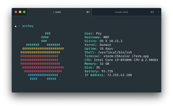
Make Your iTerm2 Look Beautiful
It’s been a couple of months since I switched to iTerm2 from macOS’ default Terminal.app, and though I’m getting used to the many nice features like split-panes, tons of shortcuts and all the customization options, I still find myself taking secret glances at the beautiful Hyper terminal emulator.
That is, until I discovered to do the same in iTerm.
Turns out there’s a long open issue on Gitlab for adding advanced UI customization options to iTerm2, which was finally marked as closed just a few months ago. A lot of the people involved in the discussion share my love for Hyper’s beautiful interface and want the same in iTerm – and the generous developers delivered on that.
It’s all in the Configs
So now that you want your iTerm looking slick, you need to change some “advanced” options in the settings:
- Open iTerm2 preferences (
⌘,) - Go to Appearance > General
- Change Theme to
Minimal
That’s it. Yep, that’s all you need to do to enable that pretty UI. But you can go ahead and customize the specifics even more depending on your taste. Some other iTerm settings I’ve changed are:
- Appearance > Windows:
- Hide window numbers
- Hide scrollbars
- Disable transparency in fullscreen
- Appearance > Tabs:
- Hide tab bar when there is only one tab
- Appearance > Panes:
- Show separate status bars per pane
- Appearance > Dimming:
- Considerably decrease dimming ammount
- Profiles > General:
- Working Directory: Reuse previous session’s
To make more advanced customizations, you can go to the Advanced tab and search
for minimal where you’ll see some more options for the chosen iTerm style. Some
other things I’ve configured are:
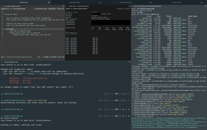
This is usually what my iTerm window looks like while I’m working:

